

While Steam dominates the online gaming market, the mobile application is known to be particularly underwhelming.
The aim of this case study involves reimagining the Steam app, focusing on layout, features and interactions. All changes will be made with the intent of elevating the holistic playing experience of the user, and improving accessibility - creating a better interconnected experience.
I was given two weeks to complete this project, from research to proposed changes.
Users appear to dislike the experience using the Steam App, and several reviews point to the fact that it is just the desktop website in a mobile wrapper.
The experience is unintuitive, and extremely messy.
Users also complain about the functionality of the app's features, namely Steam Guard and the removal of the user chat.

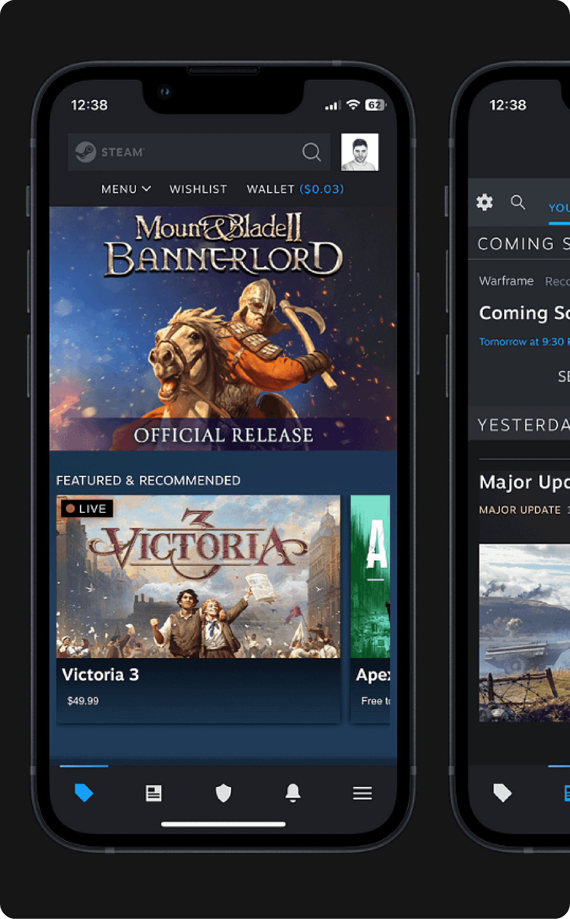
It is evident looking at the application that it is just the desktop website in a mobile wrapper - as user reviews suggested.
Through analysis of the UI, a lack of repetition in shapes and layout was found, making the experience lacklustre and confusing at times.
Furthermore, the application switches between the desktop client UI and an up to date mobile UI depending on the page.

During usability tests of the Steam application, users perceived the user interface to be overly cluttered and lacking uniformity.
The position and arrangement of the "community homepage" section appeared to baffle the majority of participants.
Locating the "Friend code" for the user proved challenging for a significant amount of users.

Through research, it was found that the Steam userbase use the mobile App for the sake of Convenience, Staying connected with the community, and to administrate what devices are signed into their account using the 'Steam Guard' feature.
Through researching user reviews, conducting user testing sessions, and performing a heuristic analysis on the application it was evident that the information shown needed to be re-organised, down to the navigation of the application, as the way it is presented now is overwhelming inconsistent, and not user friendly.

Potential features that were ideated on through the whole process of conducting a heuristic markup, user testing sessions and creating personas were then prioritised using Kano/MoSCoW diagrams.
These potential features were sorted into "High", "Mid", and "Low" priorities, so I knew exactly what to focus on given the timespan of this project.
For example, simplifying the UI to create a more streamlined experience is high priority, whereas giving users better game recommendations and integrating social media sharing options are less imperative.


Through revising the Information Architecture of the Steam mobile application I focused on making the user experience more intuitive. This was done through grouping features/navigation items that were closely related to one another, as Steam hosts a large amount of features, creating a lot of visual clutter.
The "more" tab, which used to host a lot of features was removed from the main navigation and replaced with the user's profile tab, where they can find their friend code as well as most of the features from the "more" and "profile" tabs. The "community" tabs were also removed from here, and placed in a "Dashboard" tab on the main navigation, among the "news" and "notifications" tabs. Finally, a Cart tab was also added to the main navigation, as this feature only appeared before (when something was added to the cart) on the home page.

The design system was also updated, mainly by simplifying the available colours and UI elements. Colours were simplified not too far as to make sure that the Steam brand is still recognisable, however just enough to simplify the user's experience, and create less clutter on pages.
UI elements were also taken from the existing steam app and redesigned in order to streamline the user experience and create a design style which reduces the user's cognitive load, as it can be replicated all across the application.
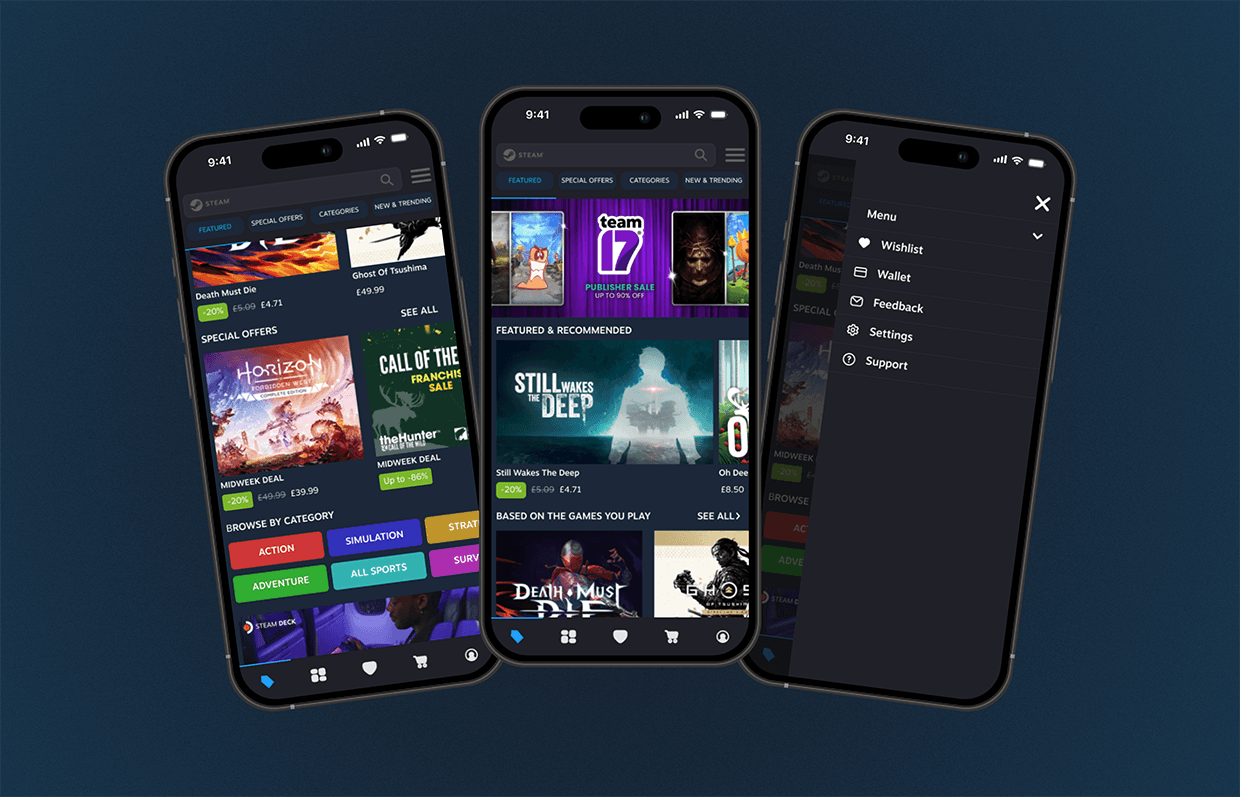
The home/store page has been redesigned to focus on simplicity and ease of use. The user can now navigate around the store using the side scroller found at the top of the page. The more tab also allows the user to access their wish list, wallet, and view the store menu.

The game page has been redesigned to show the user the most important content first - the price, "add to cart" function, and a short description of the game. To make it easier, the "reviews" are found on a separate tab a swipe away and all content concerning the game details, achievements, requirements etc, have been compartmentalised, so that the user can easily select what information they want to see.
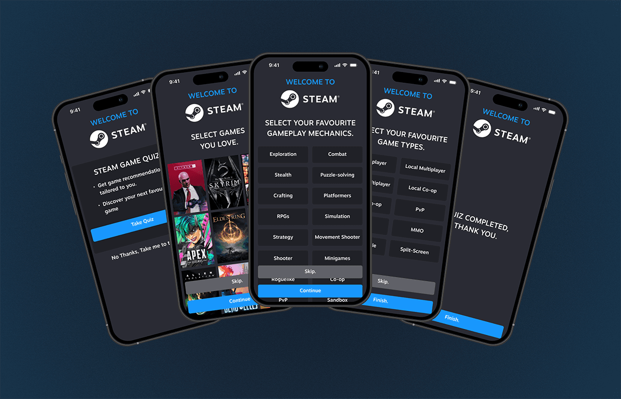
Finally, a new onboarding quiz has been added, which the user can complete if they wish. This entails the user selecting games, game mechanics, and game types they love in order to feed this information into an algorithm and give them more granular recommendations suited to their interests, or game types they would like to see more of. This creates a more interactive and user-driven experience on the app.

Going forward:
Going forward with this project I would like to conduct further research, user testing, and make further design iterations on the changes made thus far. Delving further into researching and user testing the community tabs will give a great insight into the changes that need to be made in particular to make the user's experience friendlier. Finally, I would love to experiment with giving the user personalisation tools - e.g. a "themes" option - to further tailor the experience to the user.